Mobile-optimized Email
Hello Bank Prototype
Bank of the West Examples
The Challenge
Create a high-fidelity, interactive prototype as part of a new brand exploration.
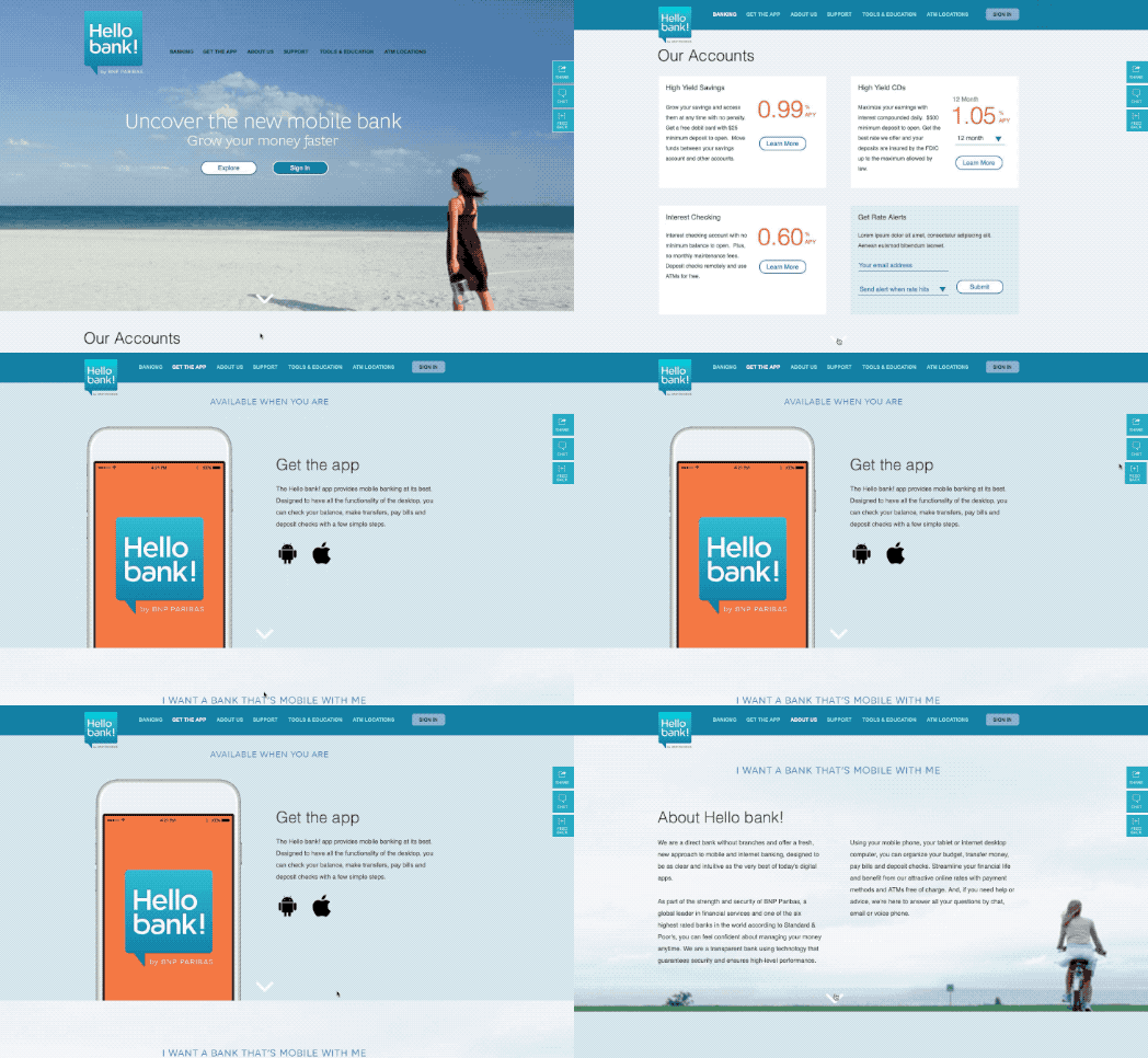
The visual design was intended to make an emotional appeal, emphasizing the liberating nature of an online-only banking experience.
The experience should underscore this feeling, with easy, un-rushed interactions and a sleek, modern feel.

My Role
The visual design was fairly complete, and I was asked to bring it to life for a series of research studies.
I collaborated with the Visual Designer to determine the interactive features that were important to the experience.
Sticky navigation, float label fields and parallax effects were fairly new then, so they were an important part of a fresh, contemporary presentation. We wanted to ensure they weren't gratuitous additions, so I took a fairly subtle approach.
I spent time fine-tuning the timing and movement of each interaction, so even the most basic inputs contributed to a smooth, easy feeling.
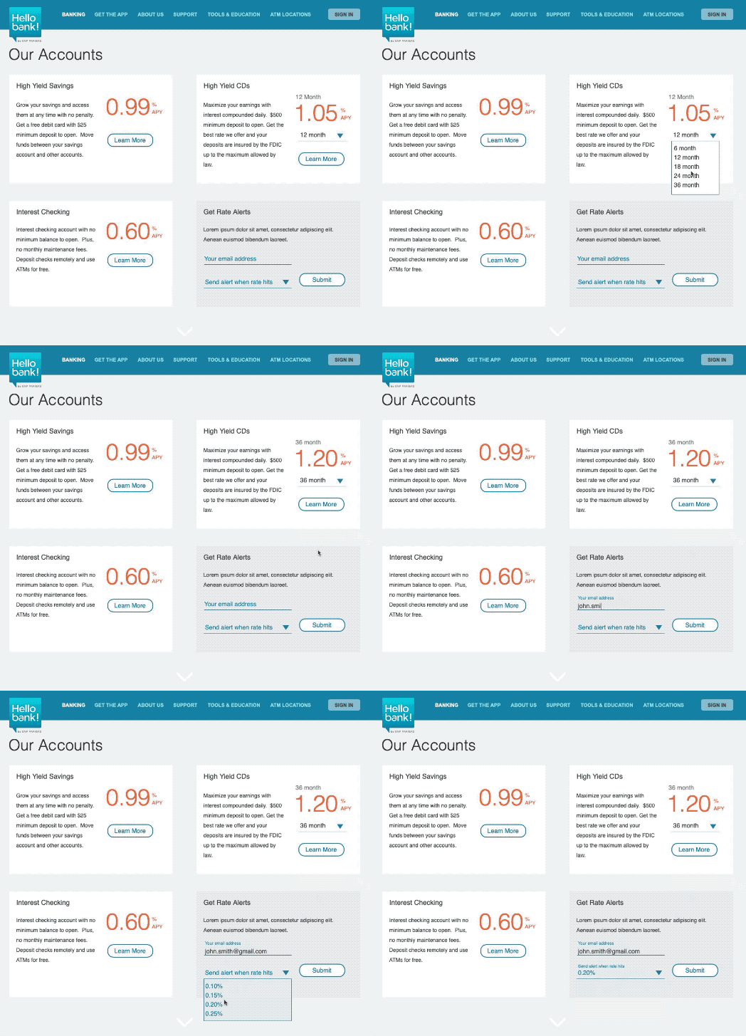
Account offerings, featuring CD term selection and rate display

It was important to provide a seamless transition as the user moved from exploration to research and decision stages.
We wanted to avoid the feeling of swimming through pages found on so many financial sites.

The Result
User studies showed the primary motivator for potential customers was a higher rate on their deposits, so the brand focus shifted to emphasize rates over convenience.
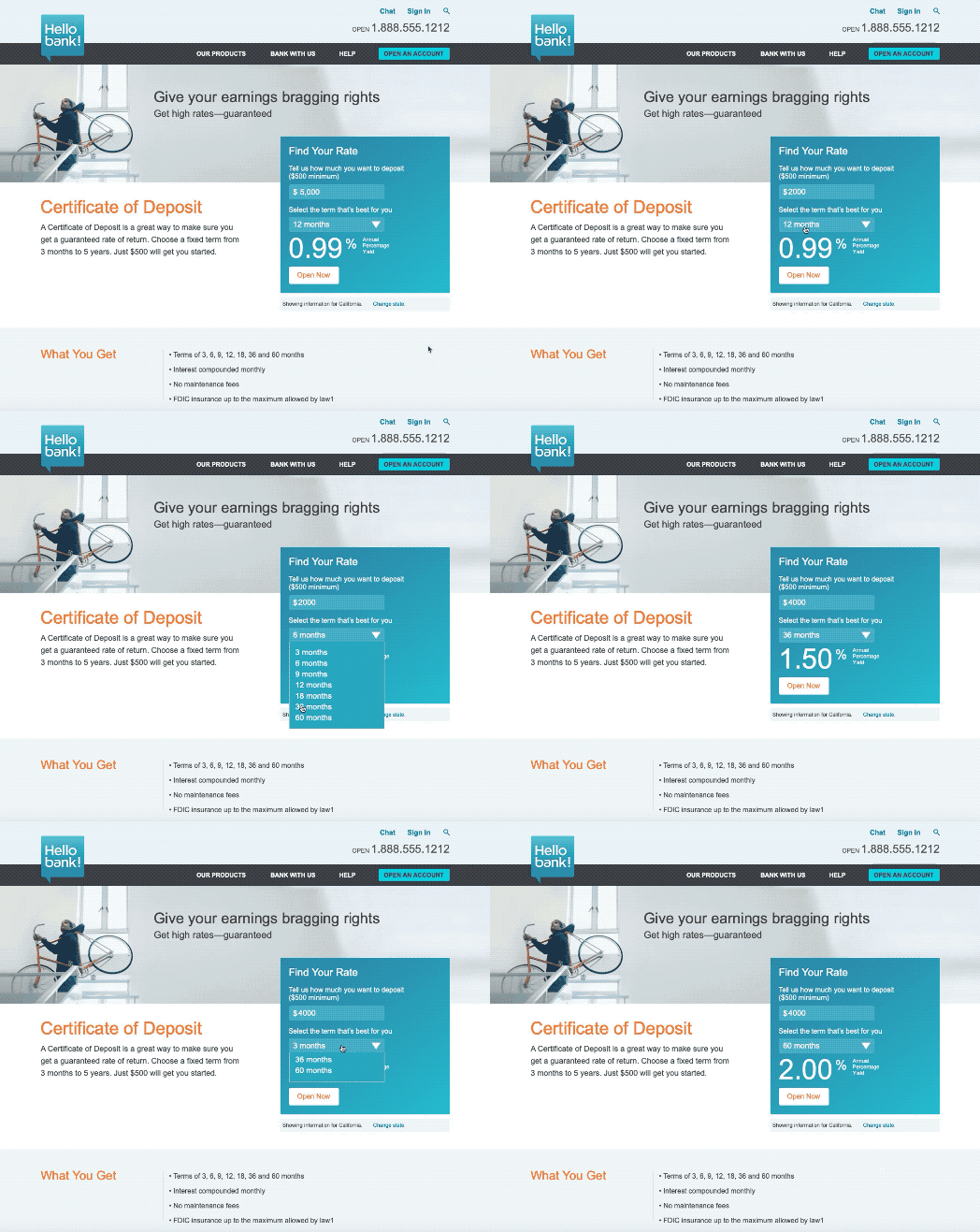
I continued to evolve several elements, such as the rates widget; the next iteration accounted for deposit amount. It was featured in a new prototype, which was built responsive using Axure's Adaptive Views feature.

Plans for an online-only bank were ultimately shelved due to a poor interest rate environment. Many of the ideas developed here found their way into a major redesign of the Bank of the West site.
This experience was a great opportunity to push my Axure skills to a new level. I went on to work closely with the Usability Team, building prototypes for several high-profile usability tests.