Mobile-optimized Email
Online Account Opening
Bank of the West Examples
Online Account Opening
The Challenge
Overhaul our online account opening flow, focusing on a streamlined mobile experience.
Provide guidance and inspiration to our vendor as they planned an upgrade to their responsive platform.
User Journey Map captured issues with the current experience

My Role
I created a User Journey Map as a reference in discussions with the product owner and usability engineer to determine our priorities.
I then used Axure to create a mobile prototype to capture the end-to-end experience and illustrate specific interactions we wanted the vendor to adopt.
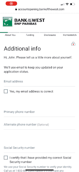
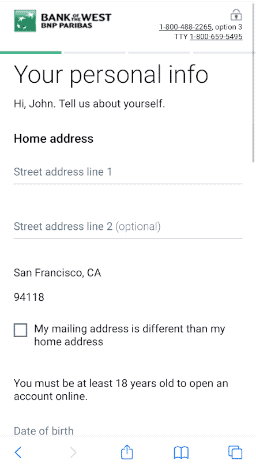
Field formatting was key to a streamlined mobile experience. Placeholder text guide the user's input and avoid error messaging. Auto-formatting saved the user from switching keyboards by automatically inserting slashes or dashes between number groups.
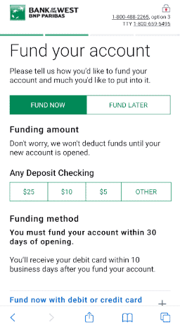
Segmented controls were used instead of radio buttons and drop-down lists wherever possible.
These elements provide clear labels and large tap areas, allowing users to quickly identify choices and make a selection.
Segmented controls allow the user to quickly select a funding amount
The Result
My designs influenced the vendor's upgraded platform and our collaboration strengthened the relationship as we requested additional features.
Our core goals of improved organization, crisper content and use of mobile best practices ensured the new experience was a generational leap forward.
Video of live site