Wells Fargo: Alerts Mobile Redesign
Modernizing Wells Fargo’s mobile alerts system across app and email.
As Wells Fargo expanded its mobile banking capabilities, the alerts system had fragmented across legacy web components, mobile app patterns, and email templates.
I designed the alerts experience across the mobile app and outbound email, creating a unified system that made notifications easier to understand, manage and scale.
The work involved direct collaboration with product partners, content strategists and engineering teams to define consistent interaction patterns, content guidelines and delivery channels.
Snapshot
Role: Senior Product Designer
Scope: Mobile banking alerts system
Platforms: Mobile app and email notifications
Focus areas
-
Mobile app message center redesign
-
Alerts subscription management
-
Mobile-optimized email framework
-
Notification content strategy
Outcome
-
Unified alerts inbox and subscription management
-
Scalable template supporting 50+ alert types
-
Mobile-optimized email framework adopted across alerts
The problem
The Wells Fargo alerts system had evolved over time as separate features were introduced.
By 2020, the experience had several structural problems.
The mobile app inherited patterns from the responsive desktop experience, creating a navigation model that was difficult to understand on smaller screens.
Alerts were split across multiple destinations:
-
Secure inbox messages
-
Outbound email notifications
-
Alert subscription management
The subscription experience also defaulted to a single account, which made it difficult for customers to understand the full range of alerts available across their accounts.


Outbound email notifications presented another challenge. The legacy email template had been designed for desktop viewing and required users to zoom and scroll to read important information on mobile devices.
The bank’s broader mobile redesign initiative created an opportunity to modernize the alerts experience and align it with contemporary mobile interaction patterns.

The alerts system as a whole
Alerts operate as a multi-channel notification system rather than a single feature inside the mobile app.
Account activity triggers alerts that can be delivered through several channels, while the mobile app provides the central place for customers to review and manage them.
The redesign focused on simplifying how these pieces work together.
Design strategy
With the system structure clarified, the redesign focused on three principles that simplified how customers read and manage alerts.
1. Alerts should live in one place
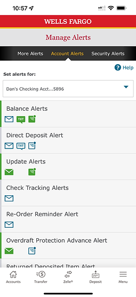
The redesign introduced a unified Message Center that combined the inbox and subscription management into one navigational structure.
This made alerts easier to discover and easier to control.
2. Alerts should reflect the customer’s full financial picture
The new experience surfaces all eligible accounts immediately, giving customers a complete view of the alerts available across their accounts.
This improved discoverability and reduced configuration friction.
3. Alerts must be glanceable
Content and layout needed to communicate the essential information immediately.
This principle shaped both the mobile app interface and the email notification framework.
Mobile app redesign
The first major component of the project focused on the mobile banking app.
The legacy alerts experience divided functionality between several screens, which created unnecessary navigation complexity.
The redesign introduced a single destination for alerts inside the mobile app.
Two primary tabs structured the experience:
-
Inbox
-
Manage Alerts
This structure allowed customers to review alerts and adjust their notification preferences without navigating to separate sections of the app.


Scalable alert templates
The alerts system supports dozens of alert types across multiple account categories.
To accommodate this variety, I designed a flexible subscription template that could support more than 50 alert types across 13 account categories.
Each alert screen uses a consistent structure that allows customers to quickly:
-
Enable or disable alerts
-
Choose delivery channels
-
Configure thresholds or timing
This template-based approach ensured the system could scale as new alerts were introduced.


Mobile-optimized email
Alerts also needed to work effectively outside the app. Many alerts are delivered through email, where the legacy template had been designed for desktop viewing.
Users frequently had to pinch-zoom and scroll horizontally to read the message on a phone. To address this, I analyzed notification emails across several industries to identify patterns that worked well on mobile devices.
The new email framework emphasized:
-
Minimal branding
-
Large typography
-
Concise content
-
Clear hierarchy
-
Prominent call to action
My guiding principle for the email content strategy was simple:
Glanceability: eight words and a call to action.
User research explored illustration, photography, and iconography styles, ultimately selecting illustration as the best balance between clarity and warmth.

Outcome
The redesign established a scalable foundation for alerts across Wells Fargo’s mobile banking ecosystem.
Key improvements included:
-
A unified Message Center for alerts and subscriptions
-
A scalable template supporting 50+ alert types across 13 account categories
-
A mobile-optimized email framework for outbound alerts
-
A more mobile-first approach to communication design across teams
Design lessons
Alerts sit at the intersection of information design and user trust.
Customers rely on alerts to monitor important financial events, often in moments where clarity matters more than branding or marketing.
This project reinforced the importance of:
-
Concise information architecture
-
Consistent interaction patterns
-
Communication designed for quick comprehension