BANK OF AMERICA · CASE STUDY
Auto loans application
Simplifying a complex loan application across desktop and mobile.
Applying for an auto loan requires customers to provide information about themselves, the vehicle, purchase type and financing needs, but not every applicant needs to answer the same questions.
I redesigned Bank of America’s online auto loan application as a responsive experience, using progressive disclosure and contextual guidance to show customers what they needed when they needed it.
Snapshot
- Role:
- Interaction Designer
- Scope:
- Online auto loan application
- Platforms:
- Responsive web
Focus areas
- Responsive interaction design
- Progressive disclosure
- Form guidance and validation
- High-fidelity prototyping
- Usability testing
Outcome
- Redesigned application launched nationwide six months after kickoff
- More than $50 million booked in the first month
- Prototype used for stakeholder review and usability testing
The redesign
The problem
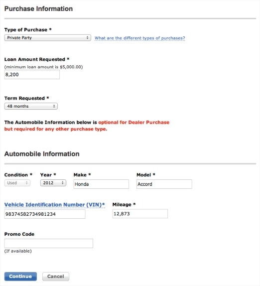
The existing auto loan application exposed customers to fields that were not always relevant to their situation.
Instructions were often communicated through red text and disabled form controls, requiring customers to interpret the interface before they could determine what information they actually needed to provide.
The redesign needed to simplify the experience while also supporting a responsive layout across different screen sizes.
The legacy experience relied on warning text and disabled fields to explain what information was required.
Three design principles
Ask only what is relevant
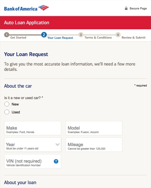
Progressive disclosure allowed the application to adapt to the customer’s purchase and loan scenario, showing only the fields required for that situation.
Guide customers forward
Contextual guidance and field hints helped customers understand what information was needed before errors occurred.
Make the process understandable
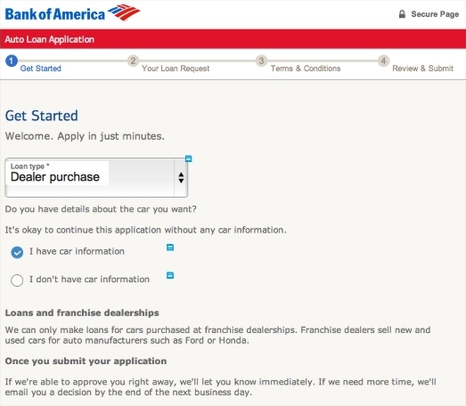
The beginning of the flow established what customers would need to complete the application, while the approval experience clearly communicated the result and next steps.
The redesigned flow establishes the customer’s situation before asking for detailed information.
Progressive disclosure keeps the application focused on information relevant to the customer’s specific loan scenario.
Prototype as an alignment tool
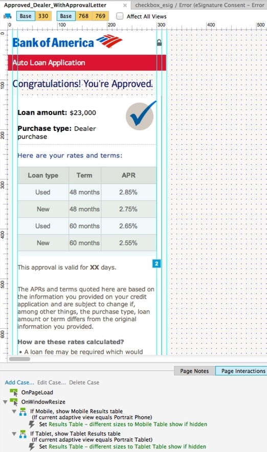
I built the experience as a high-fidelity Axure prototype using Adaptive Views to define layouts across breakpoints.
Variables captured user inputs and controlled dynamic states, allowing the prototype to behave much like the finished application.
That fidelity made it possible to review complete interactions with business partners rather than discussing individual static screens.
The prototype was also used in usability testing and refined based on participant feedback.
The Axure prototype used responsive layouts, variables and conditional interactions to model the application end to end.
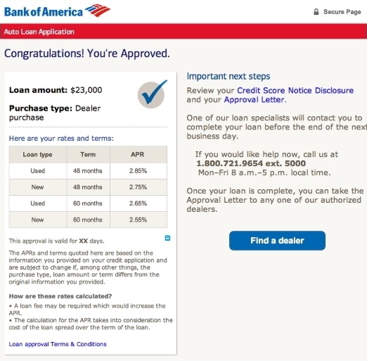
Approval and next steps
Completing an application is not the end of the customer’s journey. The redesigned approval experience clearly presented the loan amount, available rates and terms, and what would happen next.
This replaced ambiguity at a critical point with a clear result and concrete next actions.
Results
Results
The redesigned application launched nationwide six months after project kickoff.
In its first month, it booked more than $50 million in auto loans.
Progressive disclosure simplified the application, while the prototype helped us test the full flow before launch.