BANK OF THE WEST · CASE STUDY
Online account opening
Opening a bank account online is one of the most complex flows in digital banking.
Regulatory requirements, identity verification and funding all need to be handled in a sequence that customers can understand and complete without frustration.
I worked with product owners, usability researchers and our platform vendor to shape a mobile version of the existing account opening experience.
Snapshot
- Role:
- Interaction Designer
- Scope:
- Online account opening flow
Focus areas
- Mobile interaction design
- Form input design and validation
- End-to-end flow prototype
- Vendor collaboration
Outcome
- Mobile experience built on existing platform
- Prototype used to guide the vendor’s mobile design
- Key interaction patterns adopted in the new experience
The design
The problem
The existing account opening platform was built for desktop.
The vendor began planning a mobile experience, but the underlying platform, page sequence and compliance logic would remain in place.
That created a clear design challenge: make the experience work well on mobile without rebuilding the system underneath it.
Key concerns included:
- Helping users stay oriented through a lengthy application
- Reducing unnecessary effort and confusion
- Making progress clear through structure and content
Understanding the journey
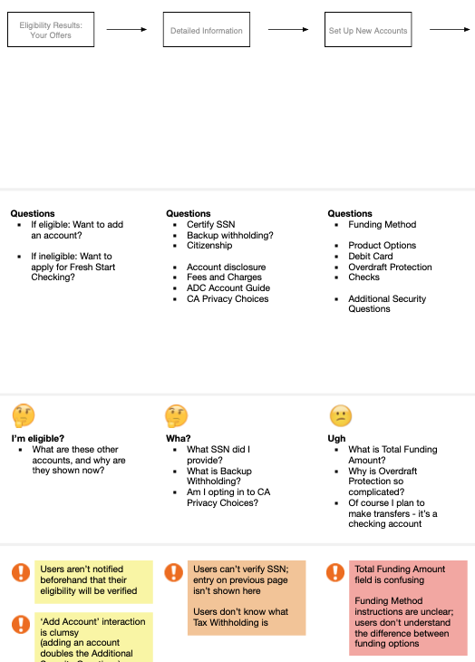
Before designing the mobile version, I mapped the existing desktop flow to identify where users were currently struggling.
The journey map gave product owners and the vendor a shared view of where we should focus our efforts.
Three key areas stood out:
- Content could better set user expectations throughout the experience
- The large number of input fields could increase frustration on mobile
- Lack of perceived progress across the long sequence of steps
Our priorities
Based on the journey map discussions, the redesign focused on these priorities:
- Reduce data entry errors
- Improve mobile input controls
- Provide clearer structure across the account opening steps
Designing for mobile
Because I already knew the desktop flow and the platform behind it, I could focus on what needed to change for mobile.
Field formatting
Field formatting helped reduce errors and speed up completion.
Placeholder text showed customers what to enter, while automatic formatting reduced the need to switch keyboards or add separators manually.
For example:
- Dates automatically inserted slashes
- Account numbers grouped digits appropriately
These small changes made data entry faster and easier.
Segmented controls
Where possible, segmented controls replaced radio buttons and dropdown menus.
They provided clearer labels, larger tap targets and faster comparison between options.
This pattern worked well for choices such as funding amounts and account options.
Results
Prototyping the mobile experience
I built a high-fidelity Axure prototype showing how the existing account opening flow could work as a mobile experience.
The prototype:
- Showed the proposed mobile interactions
- Let us review the full flow with usability researchers
- Gave the vendor a concrete model to work from
Instead of reviewing isolated screens, stakeholders could work through the proposed flow from start to finish.
The prototype gave the vendor a concrete model for how the existing platform could be adapted for mobile without simply shrinking the desktop experience.
Because I understood their platform well and had established a good working relationship, we were able to directly influence their new mobile experience.
The final design kept the underlying platform and business requirements intact while introducing clearer steps, better mobile controls and more consistent form behavior.